 |
| Fig. 1 Current Events |
I. Background
In the first post of this series we saw that the relationship pattern between Conservative Temperature (Θ) and Potential Enthalpy (hO) matches (Patterns: Conservative Temperature & Potential Enthalpy).
There is little wonder in that discovery, since Dr. McDougall writes in his paper that Potential Enthalpy is the "heat content" in seawater; but not only that, he points out that change in Potential Enthalpy is the heat flux of seawater (McDougall, 2003).
That proportional relationship (thermodynamic proportion) between a temperature component and a heat component (heat uptake, flux, etc.) helps us gain knowledge about one of the major concerns of oceanography today (In Search Of Ocean Heat, 2, 3).
 |
| Fig. 2 WOD Layers 15-17 |
II. Today's Graphs
Now that we know what to look for in order to track heat flux all the way to the bottom of the oceans, let's get to work.
Today, I present some graphs of the ocean waters around Antarctica in WOD layers 15-17 (Fig. 2), where, as we learned in another series (Mysterious Zones of Antarctica, 2, 3, 4; The Ghost Plumes, 2, 3), the currents flowing completely around Antarctica, in Layers 15-17, transport more water in them than all the fresh water rivers on Earth combined.
That current is depicted in Fig. 1, and there is a link in that caption to a post explaining various aspects of that awesome current.
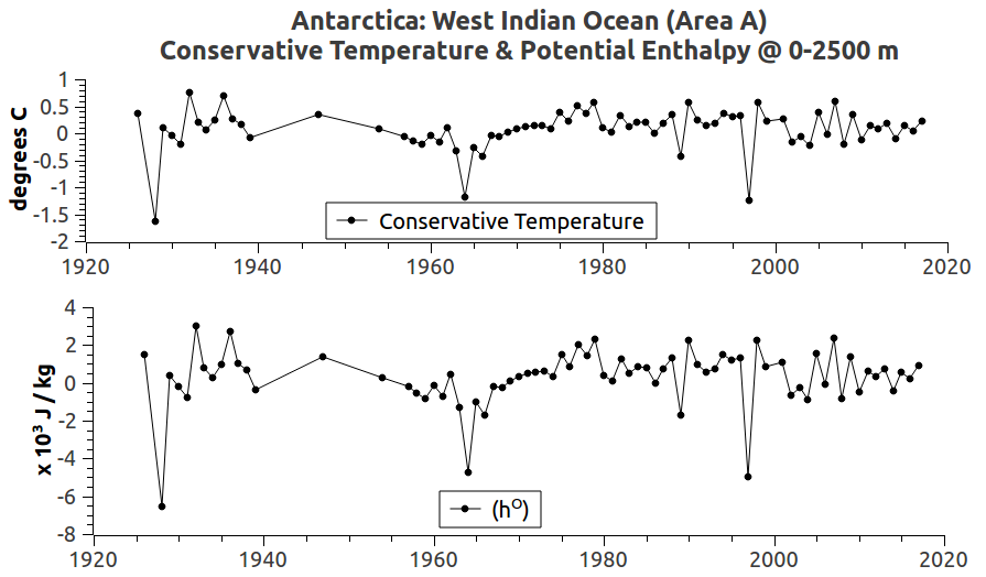 |
| Fig. 3a West Indian Ocean (Area A) |
 |
| Fig. 3b East Indian Ocean (Area B) |
 |
| Fig. 3c Ross Sea (Area C) |
 |
| Fig. 3d Amundsen Sea (Area D) |
 |
| Fig. 3e Bellingshausen Sea (Area E) |
 |
| Fig. 3f Weddell Sea (Area F) |
Those graphs show that Conservative Temperature (Θ) and Potential Enthalpy (hO) have the exact same pattern.
They have the same thermodynamic proportionality even though they have different values, plus one is temperature ( deg. C ) while the other is Joules per kilogram ( J / kg ).
Those patterns are made from in situ measurements stored in the World Ocean Database (WOD) that are calculated into Conservative Temperature (Θ) and Potential Enthalpy (hO) using the TEOS-10 toolbox.
The combined in situ measurements were taken at depths from 0 m to 2500 m for each of the zones in layers 15-17.
The depths are limited to that range because a tidewater glacier's ice face doesn't go down below sea level to that depth (2500 m) very often, if ever.
If you want to review them, those areas have been considered in other Dredd Blog posts (Mysterious Zones of Antarctica, 2, 3, 4; The Ghost Plumes, 2, 3; Antarctica 2.0 - 6, A, B, C, D, E, F).
III. Main Focus
What is so interesting to me is that the graphs show that the heat flux is due to a general increase in heat content (hO) around Antarctica.
That heat content is finding its way to the tidewater glaciers, and is melting them from the glaciers' grounding lines all the way up to and along the bottom of the floating ice shelves.
I have shown in other posts that the increasing heat content is also found at even deeper depths there.
However, since my focus is on the danger that the melting glaciers pose to seaports (The Extinction of Robust Sea Ports, 2, 3, 4, 5, 6, 7, 8, 9) I have only shown the shallow tidewater depths today (0-2500m).
Furthermore, the main purpose of today's post is to show the thermodynamic proportionality between CT and hO as harbingers of heat flux.
IV. Conclusion
As Dr. McDougall pointed out, the ocean models will continue to have errors in their heat content and heat flux computations until they replace "potential temperature" with Conservative Temperature.
While their programmers are doing that, adding Absolute Salinity and Potential Enthalpy computations a la TEOS-10 would also be steps in the direction of fewer errors.
The next post in this series is here, the previous post in this series is here.
Staying aware is one of the best forms of insurance.
ReplyDelete"Tsunami wave strikes Indonesian pop band during show" (link)
I corrected the post where it referred only to layer 16 because some of the areas also include data from zones in layer 15 and 17.
ReplyDelete