Thursday, March 9, 2017

A New Way of Analyzing The Depths - 2

Fig. 1 Layer Nine
Today, let's peruse more beta graphs, because this beta phase has helped to find bugs.

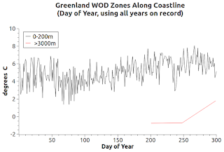
Today, I am fixing the bug that stops the day-of-year at 300 instead of at 366 (see graphs, including yesterday's).

Future day-of-year graphs will have all 366 days (where there is data on those days of course).

I haven't spotted any other bugs.

Anyway, these beta graphs still tell us a lot about subsurface dynamics.

For a quick example, compare Fig. 1 with Fig. 2.

Notice the difference in temperature dynamics between Layer Nine (equatorial), in Fig. 1, and Greenland (Arctic area) coastal water temperatures in Fig. 2.

(The "Layers" concept was presented in the series: The Layered Approach To Big Water, 2, 3, 4, 5, 6).

Fig. 2
The Layer Nine temperatures show a more stable fluctuation scenario than the Greenland area does.

The Greenland lines blend and cross over so radically that I added graphs that have only two levels per graph (Fig. 3a - Fig. 3f).

Even with that limitation, the arctic area lines still blend more than the equatorial zone temperature lines do.

I plan to do these again sometime in the future, after splicing in the OMG dataset as it grows (OMG: Oceans Melting Greenland).

Getting back to today's graphs, I also added "Salinity" graphs in the same day-of-year format (Fig. 4a - Fig. 4g).

The Greenland water salinity values are more stable than the water temperature values are, except for the upper level (0-200m).

Notice the large drop in salinity at that upper level on about day 240 of each year (probably caused by a lot of fresh water flowing from the ice sheet).

Gotta get back to work now.

The previous post in this series is here.

Fig. 3a

Fig. 3b

Fig. 3c

Fig. 3d

Fig. 3e

Fig. 3f

Fig. 4a Salinity

Fig. 4b Salinity
Fig. 4c Salinity

Fig. 4d Salinity

Fig. 4e Salinity

Fig. 4f Salinity

Fig. 4g Salinity

Tuesday, March 7, 2017

A New Way of Analyzing The Depths

Fig. 1 All day-of-year values in Zone 1000
As I indicated recently (Polar Sea Ice Trend At Both Poles - 3), I am working on modules that build a "day of year" factor into analyzing World Ocean Database (WOD) data.

Fig. 2 Same as Fig. 1 (except dark background)
I want it to work like the "day of year" graphs shown in that 1st link.

That style, which is like the NSIDC graphs of Arctic sea ice and Antarctic ice shelves, can be useful for quickly emphasizing changes (Arctic Sea Ice & Antarctic Sea Ice Are Different Types).

But beyond that, I have made it flexible enough to graph one WOD zone, a few zones (think "layers" as in The Layered Approach To Big Water - 6), the "Golden 23," or all zones.

The advantage to this approach is that we can look at selected areas of interest for a number of narrow or broad research reasons (i.e. it is ours for the choosing).

Fig. 3 Same Zone as Fig. 1, (except Salinity)
Anyway, I have to get back to beta testing and making the script files that tell the modules which zones to process.

Fig. 4 Same as Fig. 3 (except dark background)
So, I will get right to the discussion of the beta graphs I have placed into this post (Fig. 1 - Fig. 4).

These graphs are a depiction of only one WOD Zone (1000).

However, one new addition is that we look at "salinity" now (salt quantity per volume of water), not just water temperatures.

And for grins I added a dark background instead of the usual light background so as to let you comment on which you like best.

Now, before closing for today, let me explain the nature of the dataset arrangement that is used to analyze the ocean depths in this new way.

First of all, I use all data available in the SQL database I made from the WOD files available on the WOD selection site.

Regular readers know that I have downloaded all of the CTD and PFL (both "S" and "O" depth type) files for all of the zones on that selection page (many gigabytes of data).

I wrote modules to convert the WOD Format (which I liken to a slice of PI)  (Questionable "Scientific" Papers - 10) into SQL format.

The gist of this new approach includes the ability to format graphs that depict the all time high, the all time average, and the all time low values.

Values that we can compare with the current year (or any chosen year for that matter) which can give us a quick alert about the reality taking place around us (see Fig. 2 - Fig. 5) here: Polar Sea Ice Trend At Both Poles - 3).

The graphs shown today are in the same "day of year" style (in the sense that "all" the measurements, and I do mean all, were taken and placed in the WOD Database) as that zone's CTD and PFL types (active over all the years that ocean research has been active and recorded in the WOD) .

Now, it can be shown here in that "day of year" graph style.

And, we can do it for both temperature and salinity (which work together to quickly inform us of many subsurface dynamics).

As I said, I am anxious to put it to work on groups of zones of various sorts, starting with the zones in each latitude layer (The Layered Approach To Big Water, 2, 3, 4, 5, 6) .

See you real soon.

"Hands across the water (water) ..."