Friday, September 28, 2018

The World According To Measurements - 21

Fig. 1
While it might go without saying, nevertheless it is said anyway in some scientific writing:
"The ways scientists study the oceans become more and more sophisticated over time. To keep pace with their curiosity, oceanographers must often invent devices capable of helping them observe very specific phenomena. Here are the top five new instruments in the Scripps arsenal that are transforming the way we see the Blue Planet.
...
A network of more than 3,500 floats distributed more or less evenly throughout the world’s oceans is in the midst of transforming how we understand them. Called Argo, the network’s existence was enabled in the late 1980s by floats developed by Scripps scientists known by the acronym SOLO. Now SOLOs and similar types of Argo floats record the “vital signs” of the oceans: temperature, salinity, and current speed and direction. Collectively they are enabling oceanographers to observe oceans at global scales and will over time provide complete records of cycles that occur over decades."
(Five New Instruments Keeping Oceanography Fun, emphasis added). The early "instruments" (e.g. a bucket) seem utterly crude now, but they were once the only game in town:
"Water sampling devices range from a bucket dropped over the side of a ship to large water bottles sent thousands of meters toward the seafloor on a wire. Probably the most commonly used water sampler is known as a CTD/rosette: it is a framework designed to carry 12 to 36 sampling bottles
Fig. 2 circa 1870 - 1929
(typically ranging from 1.2- to 30-liter capacity) and a conductivity/ temperature/ depth sensor that sends information to the laboratory so that the water bottles can be closed selectively as the instrument ascends. A standard rosette/CTD cast, depending on water depth, requires two to five hours of station time. New methods for this kind of sampling are being developed in order to reduce station time. The largest water bottles, called Gerard barrels, collect 250 liters. Particles in the water samples may be quantified with a transmissometer sent down the wire or attached to a CTD/rosette. Aboard the ship, a flow cytometer may be used to analyze particles in the form of single-celled organisms for optical properties indicative of their physiology and structure.
"
(Seagoing Tools of Oceanography, emphasis added). That reality does not apply only to the means of gathering samples, it also applies to the way the samples are analyzed after being gathered:
"As one of few who have been involved in the equation of state of seawater over the last 40 years, I was invited to review some of the history behind its early development and also the more recent thermodynamic equation of state. The article first reviews early (late 1800s) work by Knudsen and others in
Fig. 3 1930 - 1959
defining the concept of salinity. This summary leads into the development of the practical salinity scale. Our studies at the University of Miami Rosenstiel School, along with the work of Alain Poisson’s group at Laboratoire de Physique et Chimie, Université Pierre et Marie Curie, and that of Alvin Bradshaw and Karl Schleicher at Woods Hole Oceanographic Institution, were instrumental in deriving the 1980 equation of state (EOS-80) that has been used for 30 years. The fundamental work of Ranier Feistel at Leibniz Institute for Baltic Sea Research led to the development of a Gibbs free energy function that is the backbone of the new thermodynamic equation of state (TEOS-10). It can be used to determine all of the thermodynamic properties of seawater
."
(History of the Equation of State of Seawater, emphasis added). We tend to think of salinity as a measurement, such as "34.503," rather than thinking of salinity as "a concept."

Fig. 4 1960 - 2018
Actually, it can be either a measurement or a concept depending on the context.

In the most modern sense it is a concept of calculation now called "Absolute Salinity."

That term applies in the equation of state formulas encapsulated in TEOS-10, which replaced EOS-80, as that paper above points out.

If you really want to immerse your curiosity within this subject, here are some more sources of information (History of Oceanography 1, History of Oceanography 2, Ocean Exploration 1801-1900).

Meanwhile, I must move on to today's graphs.

They will show you some of the "footprints" of the history of measuring.

It could be said that they contain footprints of history in graph format.

Let's begin with the graph at Fig. 1 which shows a span of time from circa 1870 to the present.

That graph shows major measurement undulations in the late 1800's and early 1900's.

The other graphs (Fig. 2 - Fig. 4) are sections of the main Fig. 1 graph.

The graph at Fig. 2 is a section of the main graph, focusing on the time frame of the late 1800's and early 1900's.

The graph at Fig. 3 is another section of the main graph, focusing on the 1930 - 1959 time frame.

Finally, the graph at Fig. 4 focuses on the span of time from 1960 - 2018.

Notice how the degree of the measurement undulations tend to subside with time.

Are those undulations in Fig. 2, which subside substantially by the time shown in Fig. 4, the result of meager instruments developing into robust ones, a smaller number of measurements, or both?

In the main, it is probably the latter ("both").

The next post in this series is here, the previous post in this series is here.

Thursday, September 27, 2018

Hot, Warm, & Cold Thermal Facts: Tidewater-Glaciers - 5

Fig. 1 Area A-F Melting
In this series  we talk about the temperature of tidewaters that melt tidewater glaciers (Hot, Warm, & Cold Thermal Facts: Tidewater-Glaciers, 2, 3, 4).

As pointed out in this series, the seawater that melts the very cold and dense ice at the calving edge of such glaciers is very, very cold.

But less cold seawater can melt colder glacial ice that is submerged in that seawater, especially when it is being brought to the glacial ice by an ocean current that has more flowing water volume than all of the rivers of the earth combined (Mysterious Zones of Antarctica - 3, 4).
Fig. 2. Amundsen Sea

The TEOS-10 function that finalizes the several functions that calculate what temperature of seawater will cause the glacial melt is gsw_melting_ice_into_seawater (or gsw_melting_seaice_into_seawater for an ice shelf or other ice mass floating on the ocean surface).

In this series we are only concerned with tidewater glaciers, not sea ice, so I use the gsw_melting_ice_into_seawater function, which is sufficient:
"When the output ice mass fraction w_Ih_final is zero, the final state is pure seawater that is warmer than the freezing temperature and which contains no frazil ice component."
(Notes on the function, emphasis added). The water deep beneath the surface all around Antarctica where there are tidewater glaciers is less cold than it was "back in the day."

Fig. 3 Bellingshausen Sea
I mean back in the day when the precipitation falling on Antarctica was enough to keep up with the melt taking place.

The deeper waters are less cold (a.k.a. "warmer") than they were then, so the melt rate is way, way more now.

It has been said that the melt rate has tripled in the past not-so-many years.

The precipitation amount is still classified as a desert amount (the Sahara gets more precipitation), so the net result is a loss of the amount of the mass of the ice sheet.

Fig. 4 East Indian Ocean
The graphs today (Fig. 2 - Fig. 7) show why.

The melt temperature of the tidewater glacial ice is much lower than the temperature of the less cold (a.k.a. "warmer") seawater making continual contact with it.
Fig. 5 Ross Sea

The use of the term "warm seawater" is a misuse of the reality down in the deeps, because it generates and perpetuates a myth in the mind of many people.
Fig. 6 Weddell Sea

Fig. 7 West Indian Ocean
The Antarctic tidewater glaciers are melting at various depths because the waters are less cold than they need to be to keep the melt down to an amount that is offset by precipitation on the ice sheet.

That balance was lost further back than we are accustomed to thinking it did.

It began a couple of decades after the Industrial Revolution began circa 1750.

That melting began with the Greenland Ice Sheet (Proof of Concept - 5).

The Antarctic will catch up and pass Greenland in due time, which is closer than commonly expected.

A final word about the today's graphs.

The straighter lines at the bottom of the graph is the general temperature required to melt the ice and the general temperature of the seawater mix at that depth due to the melting.

The less-straight lines at the top of the graphs are the temperatures of the seawater at several depths.

Even though that seawater is cold, it is less cold by a thermodynamically significant amount.

It is that increasing difference in temperature which determines the speed of the melt.

The previous post in this series is here.

Wednesday, September 26, 2018

Databases Galore - 24

Fig. 1 WOD Zones (Quadrants & Layers
Hey gang.

I just dropped in to update you on the progress of bringing the entire World Ocean Database (WOD) to Dredd Blog readers (see Databases Galore - 22 and 23).

The short and sweet of it is that I am modifying previous programs that analyzed WOD measurements using only the PFL and CTD datasets.

It is easy to change a small number of source code locations to have a program do the same thing to the new and expanded SQL database tables.

As an example, I changed a program that analyzed all WOD Zones by quadrant (four divisions of all WOD zones ... NW, NE, SW, and SE) and by zones.

Fig. 2a NE Quadrant
Fig. 2b NE Quadrant (Zone 1813)
The graphic at Fig. 1 shows the quadrants and the zones in them (and the layers - 0-17).

Today's post does not present by layer, only by quadrant and individual zones within its particular quadrant.

Before I discuss the graphs, let me inform you that in addition to the WOD datasets (see Databases Galore - 22 and 23), I have added three specialty datasets (OMG, SOCCOM, and WHOI).

Regular readers know that OMG is Greenland specific, SOCCOM is Antarctica specific, and WHOI is Beaufort Gyre specific.

Those specialty measurements are not currently in the WOD so I add them to my SQL WOD database to enhance it.

On to the graphs.

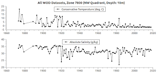
Fig. 3a NW Quadrant
Fig. 3b NW Quadrant (Zone 7800)
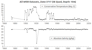
Today's graphs are introductory only to give a glance at the scope of the datasets (1800's to the present).

So, these graphs show the quadrants (Fig. 2a - Fig. 5a) and one zone from each quadrant (Fig. 2b - Fig. 5b).

Fig. 4a SE Quadrant
Fig. 4b SE Quadrant (Zone 3717)
I have generated all the quadrants and all the zones within those quadrants.

I can't present them all in one post because that consists of several hundred zones. 

Typically, in the past, I have presented zone data in a particular context (e.g. "Zones of the East Coast" ... "Zones of the West Coast") because of the enormity of the data sets (even when it was only CTD and PFL data) in the Dredd Blog SQL server.

At other times it was zone analysis by layer (e.g. 0-17 @ Fig. 1).

Anyway, the main point and the cause for my excitement is that we are now using it all to try to analyze it all.

BTW, as you can see by the use of Conservative Temperature and Absolute Salinity, the TEOS-10 toolkit is being used on the in situ data.

One thing, among several things, to remember is that the technology of the 1800's can be inferior but it can also be better at some things than modern technology (like tide gauges). 

That said, we can always try to improve today's technology but the past records are what they are and can't be improved upon now.
Fig. 5a SE Quadrant
Fig. 5b SE Quadrant (Zone 5717)

I say that because there are some noticeable gyrations in the data, which can be corroborated with other older records such as rainfall, ice berg calving, earthquake, volcano, and other such records.

I have done that upon occasion, such as when there were sea level gyrations at stations near the Fukushima area following the tsunami there.

Another one was "sudden" salinity decreases in the Patagonia area after a volcano under the ice field at a high altitude erupted.

That sent incredible amounts of fresh water onto the surface of the ocean in that area, which was then picked up in CTD records soon after that eruption.

In today's news we read and hear of vast amounts of water being dropped on various areas in the states of N. and S. Carolina, and up from there to the Washington D.C. area.

This also happens over the WOD Zones in the ocean from time to time, and can cause temperature and salinity changes to take place when such deluges or rain making storms take place.

Deeper down, the same can take place when currents act up abruptly to cause what seems to be anomalous.

"Trust but verify" is a useful concept to use when we look at the data that records the aftermath of climate change.

Much more to come.

The next post in this series is here, the previous post in this series is here.

Monday, September 24, 2018

The World According To Measurements - 20

Fig. 1 Latitude Layers
I am now using the new and increased quantities of the The World Ocean Database (WOD).

Each dataset type (APB, CTD, DRB, GLD, DBT, MBT, MRB, OSD, PFL, SUR, UOR, and XBT) has been placed into its own SQL table.
Fig 2a (T) APB, Layer 5
Fig 2b (SP) APB, Layer 5

Fig 3a (T) CTD, Layer 5
Fig 3b (SP) CTD, Layer 5
One reason for that is the variations in the different datasets.

For example, some of them do not have salinity measurements to go along with the temperature measurements.

Fig 4a (T) GLD, Layer 5
Fig 4b (SP) GLD, Layer 5
Today's graphs are made from those that have both types of in situ measurements, i.e. both T and SP.

The DRB, DBT, MBT, MRB, OSD, SUR, UOR, and XBT datasets contain plenty of in situ measurements for temperature (T) but are not adequate for salinity (SP).

At least not in the WOD layer (5) depicted in these graphs (Fig. 1).
Fig 5a (T) PFL, Layer 5
Fig 5b (SP) PFL, Layer 5

Any accurate world-view of the ocean forms in our minds according to measurements we have recorded.

Notice that the measurement streams recorded in the WOD, which I used to make today's graphs, vary according to several factors.

One factor shown in today's graphs is that the type of instruments used can have a huge effect on the results.

Other factors are the time of year, depth, and quantity of measurements.

Putting them all together into one mean average can reveal a trend when the individual ones by themselves can't (more about that below in this post).

The subject is vast (The World Ocean Database) but it can be more easily handled one step at a time (An inventory of Arctic Ocean data in the World Ocean Database).

The first step is to analyze the data types:
"(XBT) data provide one of the longest available records of upper-ocean temperature."
(The Impact of Improved Thermistor Calibration on the Expendable Bathythermograph Profile Data). It may sound good, but read the rest of the story in that paper to see that tons of work has been done to bring a lot of those measurements back to reality.

In the present situation I am going to take some time to move through all of the Latitude Layers (Fig. 1) to check out each data type one dataset at a time.

Just like I did today on Latitude Layer 5 (Fig. 2a - Fig. 5b).

Even though the WOD XBT data have no SP data, that dataset can be used for some temperature research if I figure out the best way to use that paper's suggestions to nullify any bias in that dataset.

When all of the datasets are used without careful consideration and selection (including especially the XBT dataset), they produce an inaccurate picture.

Fig. 6a (T) All layers, all datasets
Fig. 6b (SP) All layers, all datasets
The graphs at Fig. 6a and Fig. 6b
show the data gyrations when all of the datasets are used without any adjustments.

Notice that before the WW II years there is considerable gyration.

After the war years, say mid-forties, the data pattern stabilizes.

A glaring error is the in situ temperatures recorded. [see UPDATE below]

They indicate that the temperature at 250m deep is in the vicinity of 10 degrees C (~50 deg. F).

I suspect the XBT type data (all T, no SP) because the graph at Fig. 6b presents a more accurate picture after the WW II years.

The XBT has no SP measurements, so its influence is not present in the Fig. 6b graph as it is in the Fig. 6a graph.

I am going to do some more research using different combos of the various datasets to reach a best-use scenario.

For instance, what will Fig. 6a look like without the XBT (and other T only , no SP) datasets left out?

My expectation is that it will be more accurate.

UPDATE:
Fig. 7a
Fig. 7b
I added logic to the software module to conform the in situ measurements to the maximum and minimum values set forth in the WOD Manual.

Those maximums and minimums apply to every ocean area on Earth, and does so at all depth levels.

Those maximum and minimum values apply to both T (in situ temperature) and SP (in situ conductivity, a.k.a. salinity).

The way it works is if a measurement is above the maximum, it is reset to the maximum for the calculations taking place.

In this context (non TEOS-10) I consider this the better practice over rejecting the value completely.

These value go back a couple of hundred years, so "the more measurements the better" possibilities come to mind (the individual, smaller datasets shown in Fig. 2a - Fig. 5b show the effect that lack of data has on graphs).
Fig. 8a
Fig. 8b

Anyway, as you can see (Fig. 7a - Fig. 8b) the expectation I had about the MBT and XBT datasets was not verified.

That is good news because, by adding the maximum / minimum validation to all datasets, we can safely use every  dataset in the WOD.

The "with and without MBT and XBT" datasets make virtually identical graphs (Fig. 7a - Fig. 8b).

So, now I can move on to the typical Dredd Blog processing of the full WOD datasets with the verification logic in place.

I plan, over the next few months to do graphs that were done previously on Dredd Blog using only the CTD and PFL datasets.

The main result will be a new look at the older data which in some cases goes back a couple hundred years.

The next post in this series is here, the previous post in this series is here.