Friday, January 20, 2017

Weekend Rebel Science Excursion - 58

Fig.1
I became tired of the "standard deviation" (std. dev.) graph technique, so I tried to create a new technique to replace it.

I rebelled, and mind you, this took place while I was proving that the Earth is not flat (Once Upon A Time In The West - 2).

Fig. 2

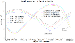
If you will be so kind as to check out Fig. 1 and Fig. 2 (cursorily or perfunctorily, your choice) you can see that summer and winter no longer happen at the same time on the poles (once called edges) of the Earth.

The peak of the quantity of sea ice in the Arctic takes place at the time the lowest quantity of sea ice takes place in Antarctica.

Fig. 3
When the Earth was still flat, summer and winter levels of ice would be at their maximum and minimum at the same time.

Oh, for the simple life again, or for the return of the great Flatulence.

Fig. 4
Anyway, let's get back to the cool and informative new graph technique I want to share with you.

The "std. dev." technique is used and shown in Fig. 7 below, I added two comments "not very telling" to that graph with pointers to the edges of the typical standard deviation.

Fig. 5
The new technique is a most-and-least boundary on the high side and the low side of the main stream of data being graphed (in this case the million km2 area of sea ice).

The new Dredd Blog technique is to construct the high side line out of the high year value (highest million km2 for that day of the year, 1-366, out of all years in the database table).

Fig.6

The same for the other side of the data flow, except it is the lowest million km2 for that day of the year.

As you can see, since the values merge when the current year is the lowest or highest year of sea ice extent, trends and essential values are at once obvious when the lines approach, go away from, or merge with one another (all graphs - Fig. 1 - Fig. 6).

Fig. 7
Doing that is not as easy as it looks, or as hard as it looks either.

The thing about it is that as you go through the central values in the database (the ice extent for a particular year, month, and day) you can preserve the lowest and highest values for that day of the year quite easily.

I use variables named "lowExtent" and "highExtent" to record the low and high for that day of the year, which requires nothing more than a comparison as to which value is higher or lower as the case may be.

Both numerically and visually, just those numbers alone, in the CSV file, and on the graph, tell a story to the alert observer (see the red numbers in the 2017 data below).

Then, when you are writing the graph data to your storage medium, you can easily add the highest and lowest values, as well as the year, along with all the other data:
1(Jan),14.217,13.794,13.371,12.608,1990,14.319,2017,12.608,7.614,6.974,6.334,5.441,2015,9.393,2017,5.441
2(Jan),14.293,13.85,13.407,12.614,1979,14.997,2017,12.614,7.454,6.791,6.128,5.319,2015,9.273,2017,5.319
3(Jan),14.355,13.901,13.447,12.705,1981,14.456,2017,12.705,7.247,6.597,5.947,5.172,2015,9.154,2017,5.172
4(Jan),14.387,13.936,13.485,12.956,1979,14.922,2016,12.873,7.095,6.432,5.769,5.043,2015,8.983,2017,5.043
5(Jan),14.437,13.987,13.537,12.932,1983,14.494,2016,12.889,6.958,6.275,5.592,5.003,2015,8.821,2017,5.003
6(Jan),14.486,14.033,13.58,12.843,1979,14.929,2017,12.843,6.795,6.128,5.461,4.856,2015,8.724,2017,4.856
7(Jan),14.545,14.097,13.649,12.852,1981,14.689,2017,12.852,6.635,5.976,5.317,4.766,2015,8.544,2017,4.766
8(Jan),14.589,14.135,13.681,12.879,1982,14.993,2017,12.879,6.479,5.816,5.153,4.694,2015,8.423,2017,4.694
9(Jan),14.631,14.173,13.715,12.847,1989,14.701,2017,12.847,6.326,5.657,4.988,4.597,2015,8.216,2017,4.597
10(Jan),14.667,14.201,13.735,12.884,1979,15.19,2017,12.884,6.2,5.535,4.87,4.426,2015,8.033,2017,4.426
11(Jan),14.708,14.25,13.792,13.054,1989,14.819,2017,13.054,6.055,5.406,4.757,4.276,2015,7.849,2017,4.276
12(Jan),14.762,14.294,13.826,12.869,1979,15.327,2017,12.869,5.908,5.264,4.62,4.026,2015,7.613,2017,4.026
13(Jan),14.778,14.327,13.876,12.869,1989,14.921,2017,12.869,5.769,5.146,4.523,3.98,2015,7.492,2017,3.98
14(Jan),14.847,14.377,13.907,12.855,1979,15.352,2017,12.855,5.644,5.034,4.424,3.838,2015,7.387,2017,3.838
15(Jan),14.883,14.41,13.937,12.887,1989,15.011,2017,12.887,5.506,4.906,4.306,3.642,2015,7.193,2017,3.642
The red-numbered years are the high extent beginning and ending years for that day of the year (1-15).

They tell a story about sea ice extent highest levels being set decades ago, but they also tell a story about the global warming caused low sea ice extent records being set before our very eyes.

That is the "art" and science of rebelling and telling a big story with the usage of the fewest numbers in a dataset.

The next post in this series is here, the previous post in this series is here.


Thursday, January 19, 2017

Alarmists Unite !

Fig. 1
We just finished three sequential years of "the hottest year on record" with the end in sight (Hansen).

"Temperatures are heading toward levels that many experts believe will pose a profound threat to both the natural world and to human civilization." (We're Number One).

After all these years of Dredd Blog being an "alarmist" it is really beginning to become the best thing going, because without any alarm there is no chance to respond (Global Climate & Homeland Insecurity, 2009).

Some have even fingered the U.S.eh? as the Agnotology capital of the world:
"Americans always do the right thing, after exhausting all other possibilities."
Fig. 2

- Winston Churchill


"There is a cult of ignorance in the United States, and there has always been. The strain of anti-intellectualism has been a constant thread winding its way through our political and cultural life, nurtured by the false notion that democracy means that 'my ignorance is just as good as your knowledge.'

~ Isaac Asimov
Global warming deniers have now taken the helm of the U.S. Government.

Thus, the cool thing for those suffering from the denialist plague, who like to think that getting a heads up by a warning is a bad thing, is to erase our memory with their new-found power.

"One if by land, two if by sea" seems to be another part of history skipped over by those who are not here (You Are Here).

Fig. 3
Now that the acceleration of heating, the acceleration of ice sheet collapse, and the acceleration of catastrophe expenses is upon us, the solution from Agnotology central is to do what Bill Maher suggested (see video below).

Meanwhile, we alarmists continue to study the data provided by some excellent organizations that may become endangered species, because it can be 'erased' like human memory  (PSMSL Update, PSMSL Update - 2).

Fig. 4
I have the Antarctic sea ice database working now, following the implementation of the Arctic sea ice database I talked about recently (Databases Galore - 16).

An example of the flexibility of the design is shown in Fig. 1, where data from two places as far apart from one another as one can get on this planet, are used in one graph.

Sometimes we forget that after "the librul scientists" changed the flat Earth into a globe, it is summer at Antarctica while it is winter in the Arctic (Once Upon A Time In The West - 2).

The database can be used to more easily display either one area alone (Fig. 2, Fig. 3) or two areas in one graph (Fig. 1, Fig. 4), which is why I like to have and use datasets rather than linking to graphs already made into unflexible JPEGs.

I look forward to blending and melding the sea ice datasets with other datasets regular readers are familiar with (e.g. PSMSL, WOD, GISS, CSIRO, NASA, etc.).


Wednesday, January 18, 2017

Databases Galore - 16

Fig. 1
I. Background

In a recent post (PSMSL Update - 2) I mentioned that data on tide gauge stations around the world was sparse for 2015-2016.

I contacted PSMSL by email, writing:
"Greetings,

I am an avid fan of PSMSL. The current download ("02 Jan 2017") does not have many stations with 2016 data.Are all those stations offline ... not reporting to you any more?Or am I missing something ... no pun intended.

Thank you in advance for your help.
"
PSMSL responded:
"Dear Dredd

The monthly means within the PSMSL database are supplied by a large
Fig. 2
number of dedicated data suppliers. Before forwarding the sea level data to us these authorities are required to quality control the data. This can take time. Hence the PSMSL is still receiving data values from 2015. The sea level data for 2016 will be available as it is supplied to us. Our top priority is to release the data values to users as soon as possible so the 2016 data will be available from our website as soon as we receive the data.

I hope that clarifies the situation.
"
II. While Waiting For PSMSL Updates ...

I got the idea to try to find a database from NSIDC that contained the dataset of the Arctic and Antarctic sea-ice, and was successful (NSIDC Antarctic, NSIDC Arctic).

Fig. 3
So, while we wait for officials around the world to send in their data to PSMSL, we will delve into sea-ice datasets of Antarctic sea-ice as well as Arctic sea-ice.
Fig. 4

III. Benefits of Datasets

In today's post I will show some of the benefits of having the datasets, rather than relying exclusively on the graph styles already available online (such as Fig. 7).

Fig. 5
Those graphs are fine and excellent, however, one cannot blend the JPEG graphs with datasets  (e.g. think PSMSL, CSIRO, and WOD datasets).

Fig. 6
But, if we can combine air, land, and ocean temperature datasets with the sea ice datasets there is a chance for clues to the relationship between them.

IV. Variations on Graphs

As shown in Fig. 1 - Fig. 6, we can use the datasets to look at the same data in different ways.

Fig. 7 As of January 17, 2017
The graph at Fig. 1 and Fig. 6 show the trend lines for both sea ice maximum and for sea ice minimum over decades, rather than for only the current year.

The graph at Fig. 3 shows the current year, 2017, in a way that clearly depicts how anomalously low the sea ice extent is for this time of year.

And it does so in the linear format of Fig. 1 and Fig. 6.

We can also present the data in the NSIDC format (Fig. 7) with the large curvy lines showing the annual oscillation during winter as compared to summer as shown in Fig. 2, Fig. 4, and Fig. 5.

I hope to be able to present some Antarctic dataset graphs in the next day or so.

V. Conclusion

No matter how we look at these datasets, the message coming through to current civilization is loud and clear.

The sea ice is in global warming induced transition.

It is going extinct in a historically slow, but consistent rate.

Not only that, it is doing so way before the close observers thought it would.

And even that surprising quickness is accelerating before our very eyes.

The next post in this series is here, the previous post in this series is here.

Monday, January 16, 2017

Will Elections Cure The Disease? - 4

Fig. 1 As of January 15, 2017
The Arctic sea ice has been disintegrating before our eyes for years now as the old ice, which is years and years old, is disappearing, while new ice formed each year is replacing the old.

The satellite record shows that since about October 1, 2016, the sea ice coverage extent or coverage area (expressed as km2) is setting all-time record lows (Fig. 1, Fig. 2).

That is, the ice cover is in the process of going away and a new era of an upcoming ice-free passage through the Arctic is opening up the potential for exploitation (Barry & Oil-Qaeda vs Arctic Wilderness, 2).
Fig. 2  As of January 14, 2017

That melting Arctic Ice, like the melting Greenland Ice Sheet (Fig. 3) is the work of Oil-Qaeda (Humble Oil-Qaeda, Smoke & Fumes).

Lying about it is also one of their marketing dynamics (ibid, cf. The Exceptional American Denial).
Fig. 3  Humble Bragging In 1962

These people have always had an influence over the American government (Epigovernment: The New Model - 11).

But now they are all out in the open about it, evidently not feeling any threat from the exposure (Humble Oil-Qaeda For Secretary of State).

Their ploy has always been to attack those who are revealing their bloody trail to others in the public (see video below).

But now they are unusually active as their decades-old cover up is being exposed (The Authoritarianism of Climate Change).

It is way past the time for us to realize that this is a murder-suicide pact (MOMCOM's Mass Suicide & Murder Pact, 2, 3, 4, 5).

Elections will not cure this omnicidal disease (Will Elections Cure The Disease? - 2).

The next post in this series is here, the previous post in this series is here.