 |
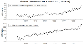
| Fig. 1 Simulated vs. measured |
I. PSMSL Update
I recently updated the PSMSL database with data up to 13 November 2017 (PSMSL).
I combine the two (annual, monthly) downloads into one SQL table.
The result was a 9 mm drop in the global mean sea level average (GMSL) in terms of the "Golden 23" ... a group which is now composed of the original 23 tide gauge stations said to be a good representation of the state of sea level rise globally (see video below).
 |
| Fig. 2 |
As it turns out, those 23 stations are located in 15 WOD Zones, which contain 303 tide gauge stations.
Anyway, the graphic at Fig. 3 shows the areas that were updated, which explains why there was a drop (9 mm) in the GMSL, because sea level is falling in Patagonia (southern tip of S. America) and the N. European area (Proof of Concept - 5).
 |
| Fig. 3 |
The trend, however, has been the same for a century or so, with sea level falling around large concentrations of ice (Greenland, Antarctica, Glacier Bay Alaska, etc), but rising where the hinge point begins (The Evolution and Migration of Sea Level Hinge Points, 2; cf. video below).
In short, our observation of sea level change is based on our measurements, which are not always geographically balanced (The World According To Measurements, 2, 3, 4, 5, 6, 7, 8).
II. New Software Module
I have wanted to have an abstraction module to help show us how balanced those measurements are or are not.
I have just completed the 1.0 version.
The module-generated-graph at Fig. 1 shows a comparison with the latest PSMSL data and the abstract version.
The lower pane in that graph is from the recent PSMSL data, while the upper pane is the abstract version.
Let me explain what the abstract version does.
The WOD manual (Appendix 11.1, Appendix 11.2) contains the high and low temperatures and salinities to be expected at thirty-three (33) depths from 0 to 5,500 meters in 30 different ocean basins around the globe.
It covers the entire world ocean temperature, salinity, etc. from surface to bottom.
I put all of that information in SQL tables for quick access.
This allows me to generate a median value (high and low values added up at each depth, then divided by 2) for temperature, salinity, thermosteric volume (cu. km) and thermosteric sea level change (mm).
I then use the TEOS-10 toolkit for generating abstract CT, SA, and volume change calculations on each depth level, as I do with WOD in situ (measured) values in non-abstract operations (Golden 23 Zones Meet TEOS-10).
Then, since we also have (in an SQL table) the GISS global mean surface temperature changes (anomalies) since 1880 (Fig. 2, upper left pane), and since ~93% of that change in surface warming (that of the atmosphere) ends up in the ocean, it can be used as a guide to map out the abstract changes in those median ocean temperatures.
That pattern-map ends up being a background to compare with our in situ measurements to see if our measurements are too centralized, i.e. located in one area or another too heavily.
The upper right pane in Fig. 2 show that abstract pattern in TEOS Conservative Temperature (CT).
Once I have the CT, the Absolute Salinity (SA), the depth, the latitude, and the longitude, I can then calculate the thermosteric volume (thermal expansion & contraction) as well as sea level changes in the abstract (Fig. 2, lower panes).
Notice how closely the patterns in the four panes of Fig. 2 match.
III. Conclusion
One take away from this is that I think it confirms the selection of the "Golden 23" that Professor Mitrovica explained to us.
The graph lines in Fig. 1 show that the abstract pattern and the actual in situ measurements pattern are quite reasonably close.
Thus, our PSMSL measurements are turning out to be quite good.
In future posts of this series, or a new series, I want to analyze the WOD measurements with this new module to see if they are as good as the PSMSL measurements.
Remember, when I indicate "good" I mean the distribution of the measurements around the glove, not the quality of the science of the measurements.
Remember also that no matter how good (in terms of accuracy) any measurements are, they have to be distributed evenly enough (e.g. not all at the poles) in order to properly inform us of the global reality.
The next post in this series is here, the previous post in this series is here.
Professor Jerry Mitrovica, Harvard University:
No comments:
Post a Comment