 |
| Fig. 1 |
In other words, melting ice sheets and land glaciers have a minor part to play in sea level rise.
This series is concerned with that popular hypothesis which has been spread among those who have not taken time to think about it deeply enough or to look at the evidence that falsifies it (On Thermal Expansion & Thermal Contraction, 2, 3, 4, 5, 6, 7, 8, 9, 10).
 |
| Fig. 2 |
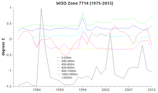
Today's graphs are used to show how ocean water mixes together for various reasons (upwelling, currents, subsurface waves, plumes, etc.), as well as showing that when so doing those layers mix not only salinity, they also mix temperatures.
 |
| Fig. 3 |
The zones used in these graphs are 1402, 1404, 3606, 3607, 3608, 3614, 3716, 5605, 5606, 5607, 5701, 7405, 7505, 7605, 7707, 7713, 7714.
They are marked on the World Ocean Database (WOD) zone map at Fig. 1 to give you an idea as to where these measurements were taken during scientific expeditions.
They show very clearly that the mixing of waters at different temperatures at different depths prevents the water from constantly warming or cooling.
Constant warming is the basis of the hypothesis of thermal expansion.
 |
| Fig. 4 |
Anyway, the way I did this was to write a software module that detects when a lower layer of water (say 1,000 meters / 3,280.84 ft. deep) is warmer that the layer above it.
While processing WOD zone data, the software keeps a count of how many times a temperature inversion takes place, and isolates that zone when the threshold reaches a certain number of instances.
 |
| Fig. 5 |
In the future I will present other samples from other areas to show that this may be a wide spread phenomenon in the world oceans.
 |
| Fig. 6 |
In some cases the coldest layer is the top layer.
 |
| Fig. 7 |
 |
| Fig. 8 |
These graphs today are single zones.
 |
| Fig. 9 |
There would be hundreds of lines on the graphs otherwise.
 |
| Fig. 10 |
The researchers who take the temperatures do so at different depths (5m, 10m, 34.5m, 100m, etc.) so to graph it, one must do a mean average at some depth layer.
 |
| Fig. 11 |
Which means that the changes observed in these graphs represent zone-wide volumes of water mixing their temperatures.
Thus indicating that significant thermal changes are taking place (both contraction and expansion changes).
Where the lines are going up and down, both expansion and contraction are taking place, depending on the temperature of the water at the time (On Thermal Expansion & Thermal Contraction).
Thermodynamics tells us that it can't be only expansion, there is also contraction.
The big players in sea level change are displacement and ghost-water (The Ghost-Water Constant, 2, 3, 4, 5, 6, 7).
Sometimes I wonder if the managers of scientific research (not the scientists) have convinced themselves that the public is incapable of "getting it."
That did not work out well for politicians who are seized of that ideology, so managers of scientific programs should not emulate it.
Reliance on thermal expansion as a, or the, major source of sea level rise ignores the fact of sea level fall near ice sheets as well as sea level fall near areas where large masses of land glaciers are melting (Proof of Concept , 2, 3, 4, 5, 6, 7, 8).
I think that the non-intuitive aspects of sea level change will be understood only when educators teach it in lower grades well before college (The Gravity of Sea Level Change, 2, 3, 4).
The next post in this series is here, the previous post in this series is here.
 |
| Fig. 12 |
 |
| Fig. 13 |
 |
| Fig. 14 |
 |
| Fig. 15 |
 |
| Fig. 16 |
 |
| Fig. 17 |
 |
| Fig. 18 |
Temperature mixes discussed in a "Science Advances" paper: link
ReplyDeleteMark found one too: (Scientists unravel the process of meltwater in ocean depths).
ReplyDelete