 |
| Fig. 1 An Ocean of Measurements |
I. Introduction
Measurements are a staple of scientific research because they are a result of observation.
I mean we can observe with our eyes, or with our devices and thereby have less to speculate about.
We can observe a mountain and then speculate about its height, but, in the realm of geography accurate measurements are the preferred technique for that research.
That is as it should be as far as I am concerned, and IMO that is also the way it should be for Oceanography, so I use all the measurements I can process:
"I recently updated the OMG, WHOI, and SOCCOM sections of the Dredd Blog databases composed of in situ ocean measurements, which along with the WOD data itself (about 5.5 billion in situ measurements - WOD Update) gives us a workable trend view."
(The World According To Measurements - 24). Having lots of data is helpful.
II. Using Measurement Data
Displaying the results of observations can be a problem when the quantity is astronomical.
For example, generally there are limitations on how much observational data can be placed in a graph.
So, in the past I have generally combined and averaged the thirty-three WOD depth levels into the five pelagic depth levels so as not to overload Dredd Blog readers (Build Your Own Thermosteric Computational System).
Likewise, I have combined the 648 WOD Zones into Quadrants and/or Layers, then averaged the data into annual values (the WOD Zones [4 digits], and WOD Layers [red numbers] are shown in Fig. 1).
Fig. 2 Appendix Menu
| Appendices |
| Layer 0 |
| Layer 1 |
| Layer 2 |
| Layer 3 |
| Layer 4 |
| Layer 5 |
| Layer 6 |
| Layer 7 |
| Layer 8 |
| Layer 9 |
| Layer 10 |
| Layer 11 |
| Layer 12 |
| Layer 13 |
| Layer 14 |
| Layer 15 |
| Layer 16 |
| Avg. Layers |
III. Lots of Data Can Be Boring
However, since "not being bored" isn't all it is cracked up to be, today's graphs contain all of the thirty-three depth levels of the WOD, SOCCOM, and Wood's Hole datasets (see Fig. 2 Appendix Menu above).
That said, still there is a limit to "how many angels can dance on the head of a pin", so, I use the thirty-three depths in a limited way; it is color/section based (WOD User's Manual, "APPENDIX 11. ACCEPTABLE RANGES OF OBSERVED VARIABLES AS A FUNCTION OF DEPTH, BY BASIN", p.78 PDF, p.68 paper-bound).The purpose of this form of graph is not to detail how many measurements can fit on the tip of a needle, rather, it is to show the results of photon distribution of ocean heat, a.k.a. "potential enthalpy" (In Search Of Ocean Heat - 5, Patterns: Conservative Temperature & Potential Enthalpy - 3).
 |
| Fig. 3 Excerpt From Graph Generating Software |
In today's post there are hundreds of zone graphs, arraigned in appendices of WOD layers (0-16 see Fig. 2 ... NOTE that layer 17 has insufficient ocean data due to land there).
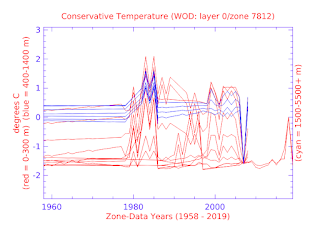
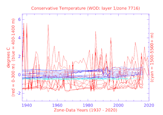
The line colors in these graphs represent three distinct depth sections composed lines which all total to a maximum 33 individual lines (red = 0-300m, deep blue = 400-1400m, and Light Cyan = 1500-5500+m).
Thus, even though there are a lot of lines (11 lines max for each color), the colors are to help discern what is going on in a depth level group.
As you can see from the graphs, the ocean heat content is very much 'on the move' within and without those three depth level groups.
That is because infrared photons can travel anywhere, including even the deep space between planets, stars, and galaxies.
IV. Usefulness of These Graphed Measurements
One thing that really stuck with me is the observation that in the Arctic Ocean region (e.g. Avg.Layers @ layer 0) the red group is 'generally' the top group (shallow depths are warmest), but in the Antarctic (e.g. Avg.Layers @ layers 15-16) 'generally' the top group is blue or cyan (deep depths are warmest)[remember that the color represents depth identity, NOT temperature ... temperature increases towards the top of each graph, and temperature decreases towards the bottom of each graph].
This is a critical bit of knowledge, because the tidewater glaciers are located on a continent that has the equivalent of over 200 feet of potential sea level change (The Ghost Water Constant).
Quantum Oceanography, among other things, is the study of ocean heat content in it's quantum-mechanics form, i.e., electromagnetic radiation (infrared photons).
When you peruse the graphs, remember that the Conservative Temperature (CT) has the same pattern as "moles of photons", and "potential enthalpy" (Quantum Oceanography).
As you peruse the individual Zone graphs (maximum of 36 per Layer), remember that the Industrial Revolution began circa 1750, so these graphs detail the ocean temperatures at least 150 years after that revolution began.
The next post in this series is here, the previous post in this series is here.


