Pages

Saturday, January 23, 2021

The Shape Shifters of Bullshitistan - 24

Fig. 1 The Banners

Regular readers will remember The Banners, the two twin tRumpist Monks who gave up their Moonshine Still and got saved (Fig. 1).

Well, those Banners became unfurled in the stormy daze of the glueAnon Annals, and unceremoniously fell off the turnip wagon that was headed to the Capitol in DC to join the January Six Secret Rupture.

Being never-give-uppers, the Banners then hitched a ride to the DC Secret Rupture with a bus-load of Buffalo Bullers, but fell into a trance while chugging boiler makers made by the West Virginia moonshiners who brew "Truffiness", a 99 Proof clear liquid "trickling down from their moonshine still named 'tRump Mountain High'" in Colorado.

After waking up alone on the bus, then stumbling into the Capitol while mooing and guffawing like true Buffalo Bullers, they were photographed and interviewed by somebody as they sang the glueAnon anthem "Dizzy", which was a cover they originally wrote about Sarah Palen (Fig. 2).

Fig. 2 The Banners Sing 'Dizzy' Anthem
Later, they were arrested by the FBI at the insistence of Sarah Palin who complained that they did not correctly repeat the glueAnon mantra.

When asked why she turned on her followers she said "it's a tRump thingy."

Read more about the saga of the saga (The Shapeshifters of Bullshitistan, 2, 3, 4, 5, 6, 7, 8, 9, 10, 11, 12, 13, 14, 15, 16, 17, 18, 19, 20, 21, 22, 23).

They, along with many of the glueAnon clump that woke up in jail later, remembered one of the saints of comedy Flip, Son of Will, who gave them a clue ... "tRump made me do it" ... and so it goes.

Their lawyers will be presenting that defense to a jury, if the judge at their trials allows such a defense in the current climate (The Authoritarianism of Climate Change).

Generally, adults must behave as adults, which means that claiming that another adult is their cultural father, but not their biological father, is not in and of itself sufficient.

They are, then, in essence saying they are "dupes" who have been "dupelicated" but that may also be a hard sell.

The next post in this series is here, the previous post in this series is here.


Friday, January 22, 2021

The Young Old Sea Level Change Hoax - 5

The World According To Measurements

In the previous post I indicated that I might not post anymore in this series because it would be futile.

But I had second thoughts when I thought about adding in situ thermal expansion and contraction graph lines on the previous graphs.

After modifying the code that generates the graphs so that it would also graph the actual thermal expansion lines I decided to do this additional post.

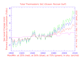
The graphs generated show the actual World Ocean Database in situ measurements along with the generated lines using the WOD Manual's maximum + minimum temperature and salinity values presented in the previous post's appendices (The Young Old Sea Level Change Hoax - 4).

The following menu links to the previous graphs (CT, hO, tsSLC) but the "ttsSLC" selection links to the new graphs that contain the actual thermal expansion and contraction graph lines (orchid color), as well as the previous simulated (WOD Manual's maximum + minimum temperature and salinity values):

Appendices
Link
Conservative
Temperature
CT
Potential
Enthalpy
hO
Depth Level
Thermosterics
tsSLC
Total Thermal
Expansion &
Contraction
ttsSLC


The additional comparison supports and confirms the arguments previously made in this series.

The next post in this series is here, the previous post in this series is here.


Appendix TsSlc

This is an appendix to: The Young Old Sea Level Change Hoax - 5

An additional graph line has been added to the previous post's graphs. It is the orchid colored line which is the graph of the actual in situ measurements contained in the World Ocean Database.


Thursday, January 21, 2021

The Young Old Sea Level Change Hoax - 4

World's Largest Desert

I. This Series

This series has presented extrapolations from the World Ocean Database Manual (Appendix 11) where that manual presents maximum and minimum temperature and salinity measurement boundaries (The Young Old Sea Level Change Hoax, 2, 3).

The gist of this series is that we can use the values in that manual in an exercise to disprove the hypothesis that "thermal expansion is the major cause of sea level rise" as well as the hypothesis that "thermal expansion is a major cause of sea level rise".

In other words, those hypotheses can be and are falsified.

This is important because we must know the causes of sea level rise if we are to avoid that serious threat (Why Sea Level Rise May Be The Greatest Threat To Civilization - 4).

II. Today's Graphs

In previous posts of this series I indicated that more graphs would be forthcoming in subsequent posts, so here are some additional graphs:


Appendices
Link
Conservative
Temperature
CT
Potential
Enthalpy
hO
Depth Level
Thermosterics
tsSLC
Total Thermal
Expansion &
Contraction
ttsSLC


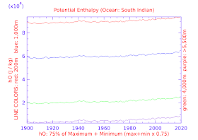
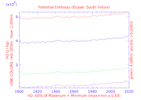
I have added some perspective to the graphs in the sense that the previous graphs considered one temperature range, which was the median between the maximum and the minimum.

Today there are two additional temperature ranges, 75% of the maximum and 25% of the maximum.

The purpose is to show that at all temperatures thermal expansion is not "the" or even "a" major cause of sea level rise.

Four depth levels are featured, which are not the same four depths shown in previous posts in this series (In a previous post I wrote that I would use different depths in upcoming posts). 

III. The "ttsSLC" Graphs

This section of graphs show the total thermosteric sea level change from 1900 to 2020 (a 120 year span of time).

Three different ocean temperature perspectives are graphed (25% of maximum, 50% of maximum, and 75% of maximum.

By "maximum" I mean the maximum ocean temperature for a particular ocean as informed by the historical GISSTEMP temperature anomaly record. 

Since about 93% of global warming increase ends up in the oceans of the world, and the GISSTEMP records are useful for historical temperature perspectives, I fuse the two together the do the thermal expansion/contraction calulations.

The result is a three-line graph that shows the result over time in millimeters of sea level change.

IV. The "hO" Graphs

The "hO" (a.k.a. "potential enthalpy", a.k.a. "ocean heat content") graphs show the heat energy in seawater at various depths.

They represent the amount in joules per kilogram (J/kg x 104) in of seawater at the relevant depths and temperatures.

V. The "CT" Graphs

The "CT" (a.k.a. "Conservative Temperature") graphs show the relevant seawater temperatures at which the ocean heat content (hO) develops.

VI. The "tsSLC" Graphs

The "tsSLC" graphs detail the thermal expansion and contraction induced sea level change (changes in volume per fixed mass unit) at specific individual depths which the maximum minimum temperature values apply to.

VII. Closing Comments

This may be the last post in this series because it has a limited purpose, which is to try to get us all to focus on the melting glacier ice at tidewater locations in Antarctica.

If researchers can't figure it out at this point, they may never do so.

The other related series here on Dredd Blog will continue to deal with in situ melting induced by in situ measurement conditions.

The next post in this series is here, the previous post in this series is here.