Pages

Friday, February 3, 2017

The Layered Approach To Big Water

Fig. 1 Layers 7 - 10
The design of the World Ocean Database (WOD) zones is well done in several ways.

There are 18 horizontal layers beginning at "the top of the world" (90 deg. N), then proceeding down to the bottom (90 deg. S).

I decided that because this layering approximately parallels the natural atmospheric temperature gradients (warmer at the Equator, then generally getting cooler in the layers nearer to the polar regions).

Fig. 2 Layer 8

I have numbered the layers 0-17, since the WOD zone numbering system uses that style (e.g. Zone 1800-1817).

Anyway, the point of this exercise is to move north and south toward the poles, graphing the big water (all the water, in seven layers, from the surface all the way to the bottom, not just the surface).

Fig. 3 Layer 9

The graphs at Fig. 2 and Fig. 3 are generated from the WOD data in the zones in layer 8 (1000, 1001, 1004, 1005, 1006, 1007, 1008, 1009, 1010, 1011, 1012, 1013, 1014, 1015, 1016, 1017, 7000, 7001, 7002, 7003, 7004, 7005, 7006, 7007, 7008, 7009, 7010, 7011, 7012, 7013, 7014, 7015, 7016, 7017), and layer 9 (3000, 3001, 3003, 3004, 3005, 3006, 3007, 3008, 3009, 3010, 3011, 3012, 3013, 3014, 3015, 3016, 3017, 5000, 5001, 5002, 5003, 5004, 5005, 5007, 5008, 5009, 5010, 5011, 5012, 5013, 5014, 5015, 5016, 5017).

Note that I do not know what this is going to reveal to us, because I do not have all the WOD data downloaded for all WOD zones.

It could get "interesting."

I will download the necessary zones that I don;t yet have (I guess I have about 20% of the WOD zones downloaded and placed into SQL tables).

So, it is also a reason for me to finish that effort.
Fig. 3  Layer 7

What I expect to see are generally changing surface ocean temperatures as we move toward the poles, but I suspect that the lower depths will not all meet that expectation (but it could go that way too).

Who knows, we may discover some warm currents, unexpected mixing of layers, and the like.

I don't know, which is why this is being done (research).

In closing for today, let me explain how the numbers are processed into a graph.

First, the zone data I use (CTD and PFL, two of several categories) is downloaded.

Fig. 4  Layer 10
It is then processed by software routines that separate the individual 'casts' into zone, year, data type (temperature, salinity, etc.), one of 7 depth levels (L1 - L7), and layer (latitude band).

That data is then processed by "a mean averaging object" (software) which combines the same years and relevant depths into an average (hundreds of measurements within a depth layer level, e.g. depth layer L1, which is 0-200m).

All of those hundreds or thousands of values, after the averaging and sorting, eventually become one of the seven lines on the graph.

This gives us an idea of what has been happening to 'big water' (all of the water) over the years at various depths.

The exclusive use of surface measurements does not do that.

Anyway, the next layers will be 6 and 11 (each one closer to its respective polar region), because I added 7 and 10 to this post (Fig. 3, Fig. 4).

We will visit all the depths recorded by the scientists of the world, then placed into the WOD.

I updated the two graphs (Fig. 2, Fig. 3) after discovering several decimal placement errors (in the WOD data @ the >3000m level).

The next post in this series is here.


Wednesday, February 1, 2017

Polar Sea Ice Trend At Both Poles - 2

Fig. 1 Arctic Sea Ice Trend
This series takes a look at the "ins and outs" of that part of the cryosphere which floats on the oceans at the "top" and "bottom" of the planet.

As the deniers take over the U.S.eh? government, heat sufficient to melt sea ice is taking over the Arctic and Antarctic areas of the cryosphere.

Fig. 2 Antarctic Sea Ice Trend

The trend for this year, so far, is to make 2017 a record year, taking that record away from 2012 (Polar Sea Ice Trend At Both Poles).

I am going to keep this series focused on that trend.

My two graphs of the data (where that data comes from is revealed in this link) show a clear and present trend to set that record.

What this means to our current civilization is somewhat like what "the canary in the coal mine" means to coal miners "way back when."

Fig. 3 Another View
But not entirely like it was way back when, because when they were warned by the demise of the delightful bird, they heeded the warning forthwith.

Nowadays every such warning, to the power-deniers that be (TPTB), are described as "nothing to see here folks, move along now."

TPTB tell us that our capabilities transcend the primitive energies of the Earth, because our genetic evolution has prevailed (On The Origin of Genieology). 

And that, even though billions of "canaries" have bitten and still are biting the dust:
This latest edition of the Living Planet Report is not for the faint-hearted.
Big Al
One key point that jumps out and captures the overall picture is that the Living Planet Index (LPI), which measures more than 10,000 representative populations of mammals, birds, reptiles, amphibians and fish, has declined by 52 per cent since 1970. Put another way, in less than two human generations, population sizes of vertebrate species have dropped by half. These are the living forms that constitute the fabric of the ecosystems which sustain life on Earth – and the barometer of what we are doing to our own planet, our only home. We ignore their decline at our peril.
(Civilization Is Now On Suicide Watch - 4). Evidently, some of us have evolved beyond the rest of us, and have now entered the "What Me Worry" zone.

The next post in this series is here, the previous post in this series is here.

Tuesday, January 31, 2017

On Thermal Expansion & Thermal Contraction - 11

Fig. 1
There is a hypothesis which says "19th and 20th century sea level rise has mostly been caused by thermal expansion due to sunlight hitting the ocean surface and thereby warming it".

In other words, melting ice sheets and land glaciers have a minor part to play in sea level rise.

This series is concerned with that popular hypothesis which has been spread among those who have not taken time to think about it deeply enough or to look at the evidence that falsifies it (On Thermal Expansion & Thermal Contraction, 2, 3, 4, 5, 6, 7, 8, 9, 10).

Fig. 2
The hypothesis is valid only to the point that it argues thermal expansion is a minor part of the specter of sea level change.

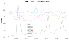
Today's graphs are used to show how ocean water mixes together for various reasons (upwelling, currents, subsurface waves, plumes, etc.), as well as showing that when so doing those layers mix not only salinity, they also mix temperatures.

Fig. 3

The zones used in these graphs are 1402, 1404, 3606, 3607, 3608, 3614, 3716, 5605, 5606, 5607, 5701, 7405, 7505, 7605, 7707, 7713, 7714.

They are marked on the World Ocean Database (WOD) zone map at Fig. 1 to give you an idea as to where these measurements were taken during scientific expeditions.

They show very clearly that the mixing of waters at different temperatures at different depths prevents the water from constantly warming or cooling.

Constant warming is the basis of the hypothesis of thermal expansion.

Fig. 4
Not only that, the second law of thermodynamics tells us that warm or hot flows toward cooler or colder water (see II. The Laws of Thermodynamics).

Anyway, the way I did this was to write a software module that detects when a lower layer of water (say 1,000 meters / 3,280.84 ft. deep) is warmer that the layer above it.

While processing WOD zone data, the software keeps a count of how many times a temperature inversion takes place, and isolates that zone when the threshold reaches a certain number of instances.

Fig. 5
That way I know which zones are mixing at a specific intensity, and I can look at them individually.

In the future I will present other samples from other areas to show that this may be a wide spread phenomenon in the world oceans.

Fig. 6
A quick look at the graphs (click on them to enlarge them) shows that intense mixing has been taking place for decades.

In some cases the coldest layer is the top layer.

Fig. 7
It is counter intuitive, but real.

Fig. 8
These graphs are not mean averages combined with other zones as many of my graphs are.

These graphs today are single zones.

Fig. 9
The graph lines representing different depths are mean averages, however.

There would be hundreds of lines on the graphs otherwise.

Fig. 10
By that I mean, the 0-200 meter top layer line is a mean average of all temperatures in one zone, from 0 (surface) down to 200 meters.

The researchers who take the temperatures do so at different depths (5m, 10m, 34.5m, 100m, etc.) so to graph it, one must do a mean average at some depth layer.

Fig. 11
I have always chosen to break it up into seven layers from the surface down to the bottom.

Which means that the changes observed in these graphs represent zone-wide volumes of water mixing their temperatures.

Thus indicating that significant thermal changes are taking place (both contraction and expansion changes).

Where the lines are going up and down, both expansion and contraction are taking place, depending on the temperature of the water at the time (On Thermal Expansion & Thermal Contraction).

Thermodynamics tells us that it can't be only expansion, there is also contraction.

The big players in sea level change are displacement and ghost-water (The Ghost-Water Constant, 2, 3, 4, 5, 6, 7).

Sometimes I wonder if the managers of scientific research (not the scientists) have convinced themselves that the public is incapable of "getting it."

That did not work out well for politicians who are seized of that ideology, so managers of scientific programs should not emulate it.

Reliance on thermal expansion as a, or the, major source of sea level rise ignores the fact of sea level fall near ice sheets as well as sea level fall near areas where large masses of land glaciers are melting (Proof of Concept , 2, 3, 4, 5, 6, 7, 8).

I think that the non-intuitive aspects of sea level change will be understood only when educators teach it in lower grades well before college (The Gravity of Sea Level Change, 2, 3, 4).

The next post in this series is here, the previous post in this series is here.

Fig. 12

Fig. 13

Fig. 14

Fig. 15

Fig. 16

Fig. 17

Fig. 18